
YouTube Thumbnail Process
When Josh, host of the Breakfast Serial YouTube channel, asked me to design some thumbnails for his new series, I jumped into Photoshop and put together a few ideas. After a quick call discussing options, we settled on a design style that could be replicated to highlight multiple subjects in separate episodes while still leaving room for unique design elements.
Here’s a simplified step-by-step process highlighting the decision making involved in reaching the final design for one of the episodes.
Step 1: Hunting for assets.
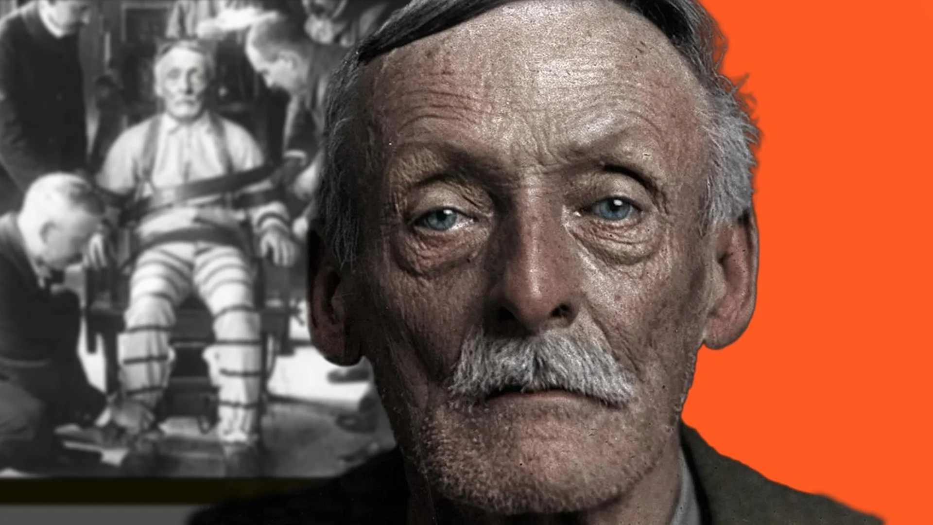
This particular subject lived before colour photography was popularized, leaving only black and white images searchable online. No problem. Here’s the image we settled on:

Step 2: Isolate and colourize.
With some help from Photoshop’s new neural filters, I was able to quickly produce a convincing colour rendition of the black and white photograph. After some masking, sharpening, and a bit of fine tuning, we have this:

Step 3: Clonestamp that collar.
The tight portrait gives us most of what we need, but the hard edge on the shoulders is distracting. Some hand drawn shoulders using the clonestamp tool will do the trick:

Step 4: Composition, depth, and additional context.
I’ve combined a couple steps here to keep this post short. First, I placed the subject on a canvas that matches YouTube’s recommended 16:9, 1920x1080 thumbnail dimensions. Next, we found a contextual image of the subject that will directly tie-in to the episode’s title (him in the electric chair). Finally, to add some depth and separation to the subject, a subtle gaussian blur was added to the background image:

Step 5: Colour.
While the colourization of the main image helps the subject standout, the overall composition is still bland. To match the branding of the Breakfast Serial YouTube channel, a bright orange colour is added to the right side of the composition. The colour contrast also helps the thumbnail standout against competing videos on YouTube:
Step 6: Additional contrast.
The colour helped, but now the brightest part of the canvas is the blurred background image. This is drawing attention away from the main subject. To fix that, I’ll add a gradient overlay to the background image:

Step 7: Additional context.
A concise text element quickly gives a potential viewer some additional information about the subject of the episode and opens up a curiosity gap when paired with the YouTube title, ultimately convincing the viewer to invest their time in the video:

Step 8: Branding.
A unique brand identifier, in this case a wordmark logo, is added to the thumbnail to immediately help viewers recognize the author of the video. It also helps balance the previously added text element by filling the opposite corner:

Step 9: Grit.
The subject matter of the episodes is often rough (to say the least). To reflect that, texture is added to the thumbnail. The added grunginess also adds some visual interest:

Step 10: More grit.
This time over the bottom left text. The white speckles also pop well on the dark background image, further separating it from the main subject and balancing the texture added in the previous step:

Step 11: Final adjustment.
After reviewing the project on multiple screens and devices, the final image is given a slight exposure bump to bring all elements to an appropriate brightness. A small yet powerful change that is often overlooked when designing for online platforms:

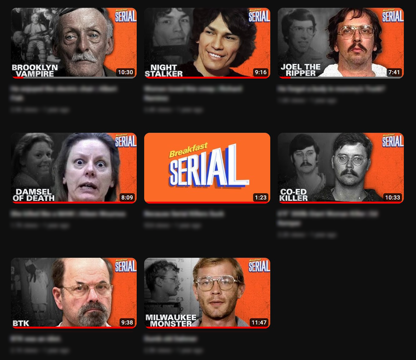
Bonus step: Repeat.
Here are a few more thumbnails created using the same formula:
Thanks for following along! If you have any questions about my work, please reach out using my contact page. Cheers.